
Yes, Chef

ROLE
PRODUCT DESIGNER

PROBLEM DISCOVERY

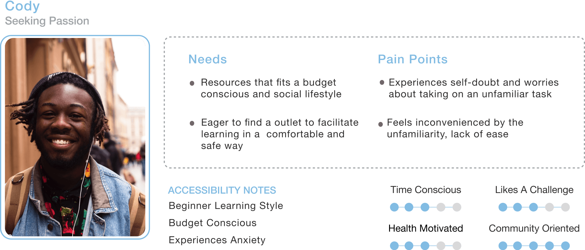
I conducted a competitive analysis, user interviews, affinity mapping, user personas and storyboarding to drive my research in developing Yes, Chef. This research emphasized a gap in the industry and passions of cooking, where there is not a mindful connection in resources and one's environment. Through this discovery, Yes, Chef was curated to understand one's limitations while prioritizing a basic need and passion for cooking.

Participants interviewed
6
Age group of
20
55

Objectives
1
Understand the lifestyles that learning how to cook compliments
work days, social events, daily enjoyment, self-help, trends
2
Determine common goals users have when cooking their own meals
basic needs, fulfilling experience, dietary needs, health, community
3
Understand the barriers and triggers that hinder one’s ability to explore
income, public health, disabilities, learning, tools


I discovered these insights


GENERATING USER PERSONAS

USER STORYBOARDING
After understanding the user and their needs, it was time to understand design requirements to prepare how to better fulfill their goals.

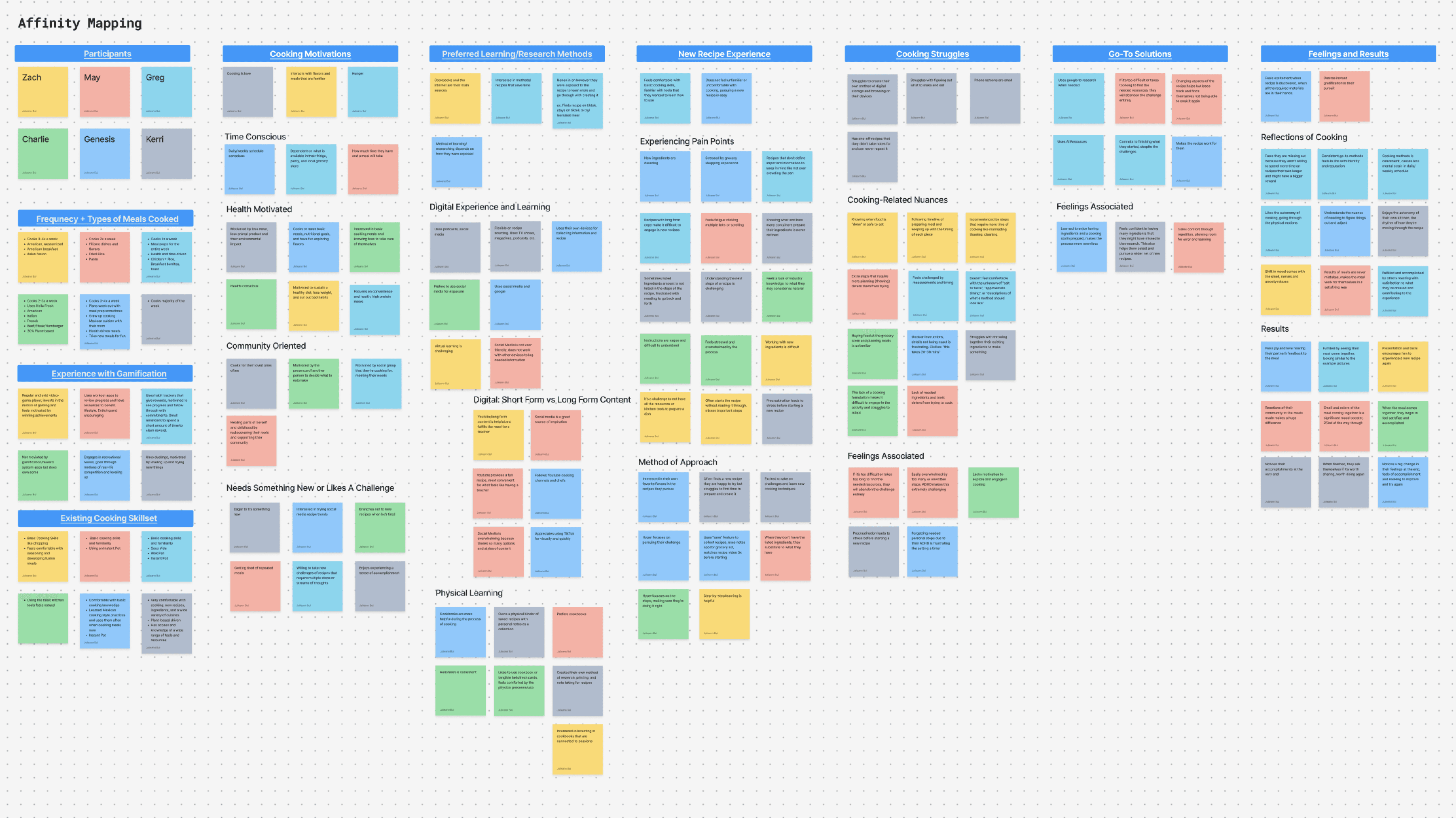
Once the qualitative and quantitative research was observed, it was time to track patterns that contributed to the insights discovered.
TOPICS EXPLORED


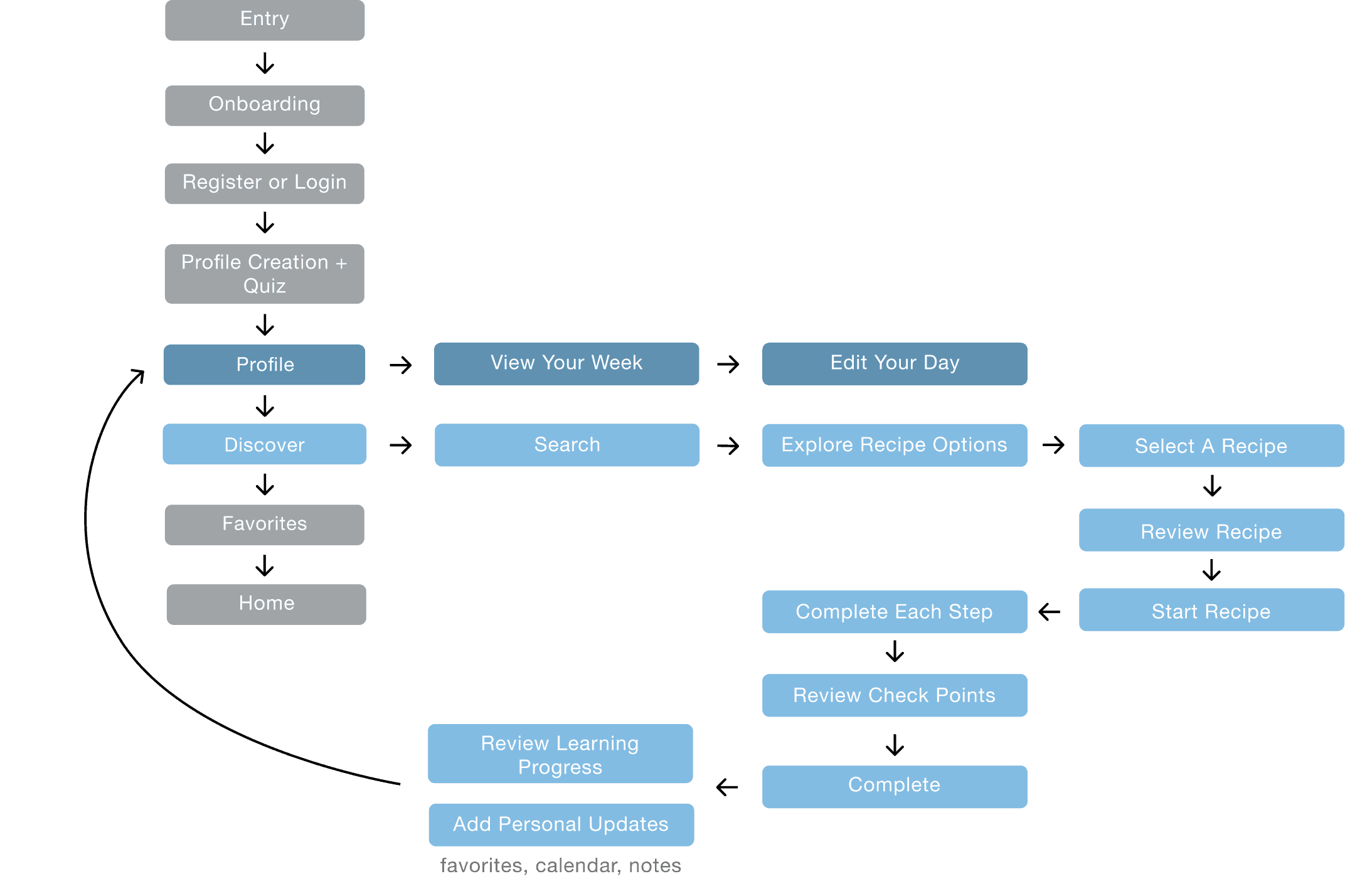


UI COMPONENTS


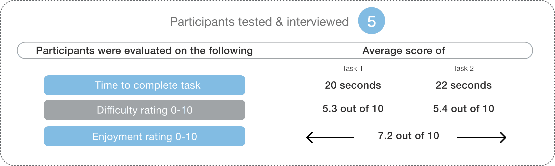
Findings Empower Solutions
Through testing these tasks, it demonstrated the wide range of intuitive design. It allowed me to focus on resourceful strategy alongside usability, where I added icons and features that are native.
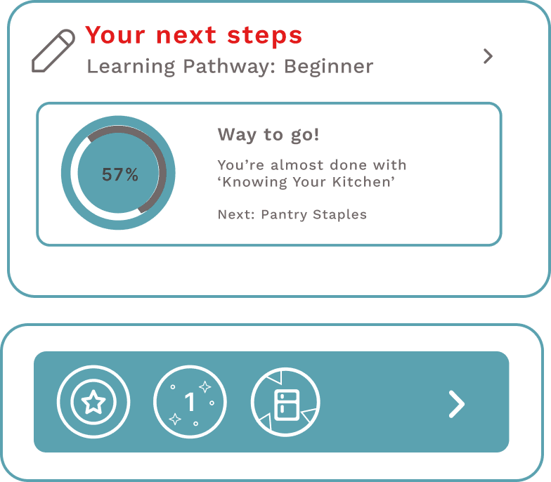
CHECKPOINT REVAMPED
Providing Better Direction with Resource Display
Created a “Check Point” button to initiate media pop up to display resources for user to ensure they’re on the right track
Removed navigation bar to lessen cognitive load and improve composition on specific features like recipes, calendars, goals, etc.
Transformed progress bar to be sticky, staying with the user and screen as they move forward.

ADDING PURPOSE

WHERE INFORMATION ARCHITECTURE HAS A PLACE
Providing Direction with Information Architecture and Native App in Mind
Created a “Sync My Calendar” option to create a relationship between our product and the native app, enabling users with an easier path to engage with the platform daily.
“Your Week At A Glance” transformed to include more common calendar features like viewing your day or monthly calendar.


TAKEAWAYS
This project started with a simple goal of empowering users in their journey of learning. It was vital to acknowledge that user’s approach learning differently and how that would influence meeting their needs.
Through user interviews, competitive analysis and information architecture, I was able to discover improved design for this product. I gained insight on accessibility in this market and industry, recognizing barriers such as familiar budgeting, gauging food readiness, and access to kitchen tools.
I wanted to build a product that would help guide learning but provide users with paths that worked best for them, ultimately nurturing their relationship with cooking.
My next steps
Developing a lesson plan to demonstrate user’s learning progress and how that integrates into skill leveling.
Through behavioral research, create a user profile creation quiz, to help further integrate personalized data for improved user experience.